If you want a CV template that is easy to edit, readable for recruiters, and unlikely to create parsing problems in applicant tracking systems, the safest option is usually a simple, single-column UK CV format. That means clear section headings, sensible spacing, standard fonts, and content that does the heavy lifting rather than design effects. This page focuses on that kind of template: practical, ATS-safe, and easy to copy into Word or Google Docs. For broader UK CV rules, structure, and length, see this UK CV format guide.
Key takeaways
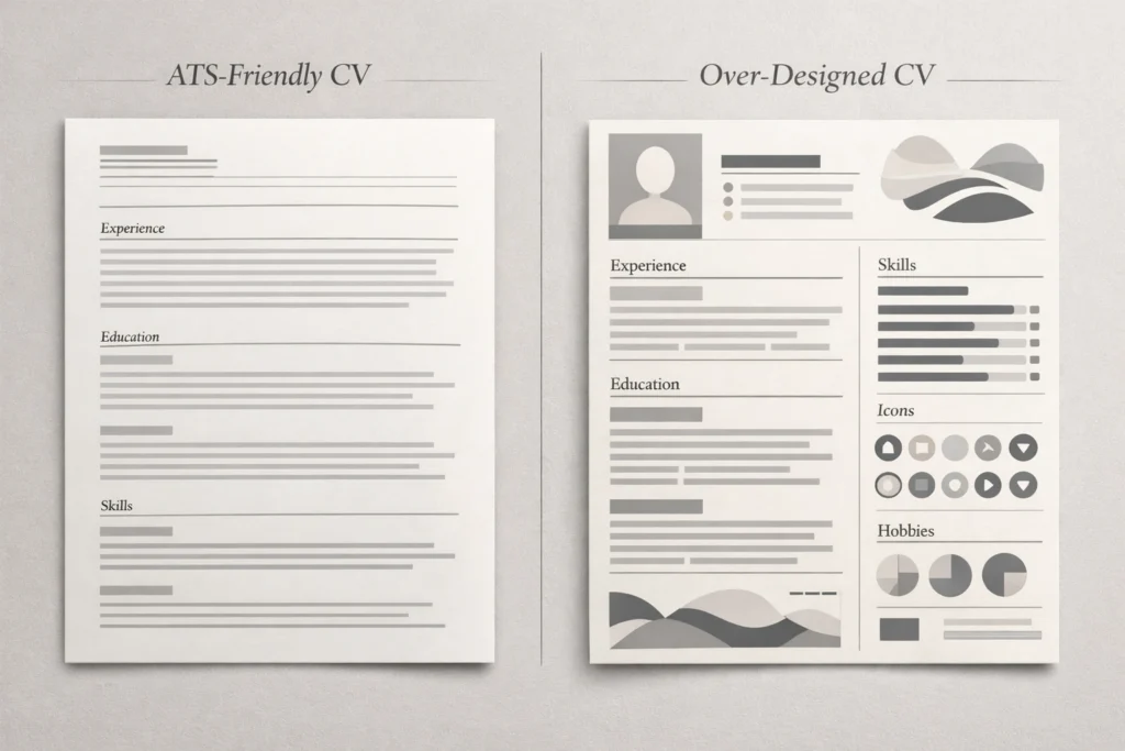
- The safest UK CV template is usually single-column, text-led, and easy to scan.
- Use standard headings such as Profile, Key Skills, Professional Experience, and Education.
- Keep formatting clean: 10.5–12 pt font, consistent spacing, and no decorative graphics doing important work.
- A template helps with structure, but strong evidence, tailoring, and achievement-focused writing still matter most.
- If you are unsure whether your CV is too design-heavy, too vague, or not aligned to UK expectations, use the primary CTA here: Free CV Review.
What makes a CV template ATS-friendly?
An ATS-friendly CV template is not about gaming software. It is about making your document easy to read, easy to parse, and easy to scan. In practice, that usually means using one main column, conventional headings, plain text for core details, and a layout that does not rely on text boxes, icons, charts, or tables to communicate important information. UK careers guidance consistently favours clear structure and readable formatting over decorative layouts, and that aligns with what recruiters tend to want as well: fast access to relevant evidence. For the official baseline on core sections, see the National Careers Service CV sections guide.
A strong ATS-safe template usually includes:
- your name and contact details at the top
- a short profile or professional summary
- clearly labelled key skills
- professional experience in reverse chronological order
- education and relevant qualifications
- optional extras such as certifications, tools, languages, or professional memberships where relevant.
What it usually avoids is just as important. Be careful with:
- multi-column layouts
- icons replacing words like phone or email
- tables in the header
- graphics, rating bars, or charts
- text embedded in shapes
- over-designed templates built more for visual impact than clarity
For a deeper breakdown of those risks, see ATS CV formatting mistakes (UK).
The practical test is simple: if someone opens your CV for a few seconds, can they immediately see who you are, what level you operate at, what kind of roles you target, and what evidence supports that? If the answer is no, the template is not helping enough. A good template should reduce friction, not add it. That is why, in most UK job searches, a straightforward Word- or Docs-friendly format is usually the safest starting point. Oxford University Careers Service also notes that employers may initially spend only a very short time scanning a CV. See the Oxford Careers CV guide.
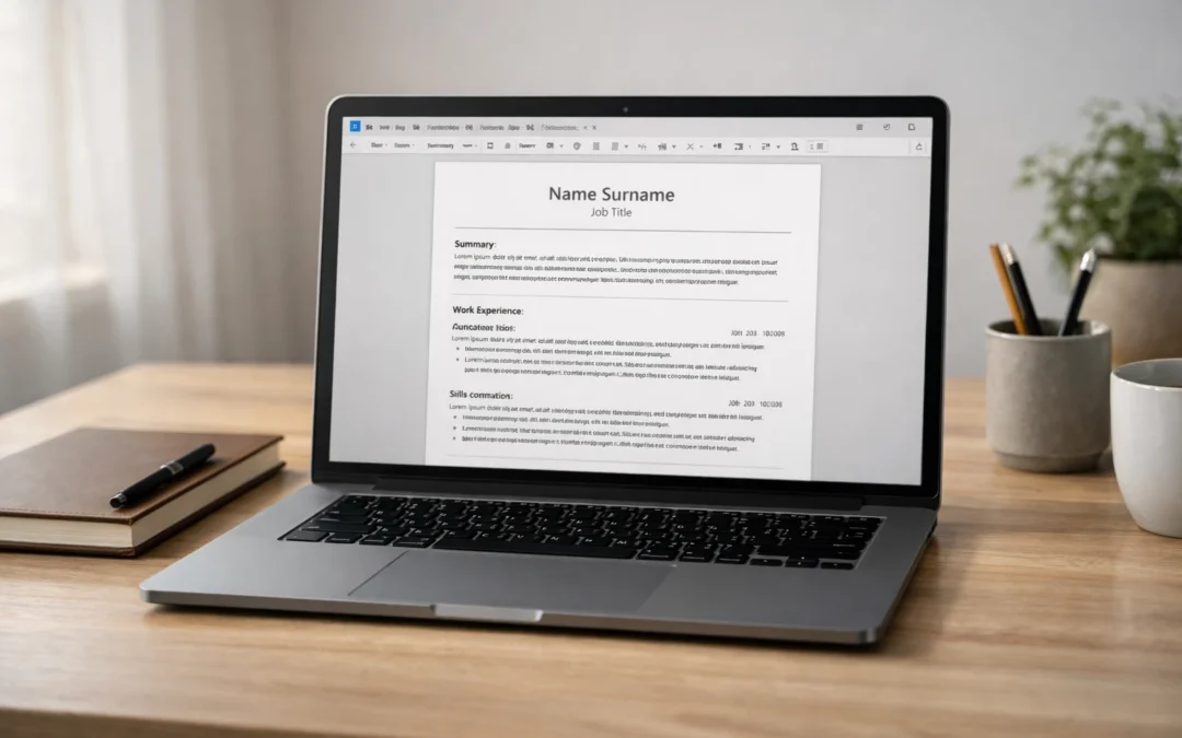
The CV template (UK): copy/paste this format
Below is a simple UK CV template designed for clarity, easy editing, and sensible ATS compatibility. It follows the core structure typically recommended in UK careers guidance: contact details, a brief introduction/profile, work history, education, and supporting sections where relevant. If you are early in your career, you can move Education above Professional Experience; if you have stronger work history, keep experience higher up the page.
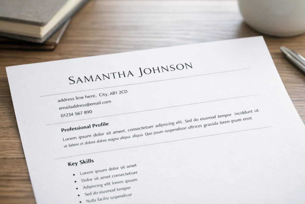
YOUR NAME
Town/City | Phone number | Professional email address | LinkedIn URL

PROFESSIONAL PROFILE
[2–4 lines]
A concise summary of who you are, what level you operate at, and the kind of roles you are targeting.
Include 2–3 strengths that are relevant to the role, plus one line of evidence or focus.

Example:
Results-focused project coordinator with experience supporting cross-functional teams, improving
administrative processes, and delivering work to tight deadlines. Known for strong organisation,
stakeholder communication, and attention to detail. Now seeking a project support or operations role
where planning, reporting, and process improvement are valued.

KEY SKILLS
- Skill or area of strength relevant to the target role
- Skill or area of strength relevant to the target role
- Skill or area of strength relevant to the target role
- Tool, system, or technical capability if relevant
- Sector knowledge, language, or specialist area if relevant
- Optional: one more high-value keyword from the job advert

PROFESSIONAL EXPERIENCE

Job Title | Employer Name | Month Year – Present
- Start with a short line explaining the scope of the role if needed.
- Use bullet points to show responsibilities that are relevant to the target job.
- Include evidence of outcomes, improvements, volume, efficiency, revenue, quality, service, or delivery.
- Keep bullets concise and specific.
- Prioritise achievements over generic task lists.

Previous Job Title | Employer Name | Month Year – Month Year
- Show the strongest and most relevant parts of the role first.
- Include actions plus outcomes where possible.
- Remove low-value detail that does not support the target role.
- Keep formatting consistent with the role above.

Earlier Job Title | Employer Name | Month Year – Month Year
- Summarise older or less relevant roles more briefly if needed.
- Use 2–4 bullets depending on relevance.

EDUCATION
Qualification | School, College, or University | Year
Qualification | School, College, or University | Year

OPTIONAL ADDITIONAL SECTIONS
Certifications
- Certification name | Awarding body | Year

Technical Skills / Tools
- Microsoft Excel, Salesforce, HubSpot, AutoCAD, SQL, Adobe Creative Suite, etc.

Professional Memberships
- Membership name

Languages
- Language | Proficiency level

VOLUNTEERING / ADDITIONAL EXPERIENCE
- Include this if it strengthens your case, fills a gap, or demonstrates transferable skills.

REFERENCES
Available on request
A few points matter here. First, keep the header simple: name, town/city, phone, email, LinkedIn. You do not need to include your date of birth, marital status, nationality, or a photo for standard UK applications, and official UK careers guidance advises against including that kind of personal detail. See the National Careers Service guidance.
Second, this template is deliberately built around standard headings. That helps both human scanning and document parsing. Resist the temptation to rename everything creatively. “Professional Experience”, “Education”, and “Key Skills” may feel plain, but plain is often useful. Recruiters do not need novelty in the layout. They need quick access to relevant evidence.
Third, treat this as a base template, not a finished CV. The structure stays relatively stable, but the content should change depending on the role. Tailor the profile, prioritise the most relevant skills, and rewrite bullet points around what the employer is actually asking for. If you want the broader UK structure and tailoring rules behind this template, see the UK CV format guide.
Formatting spec
Once you have pasted the template into your document, keep the formatting deliberately simple. In most UK job searches, clarity beats cleverness. Prospects recommends a professional, readable font such as Arial, Calibri, or Times New Roman, a font size between 10 and 12, reverse-chronological structure, bullet points for skimmability, and margins of around 2.5 cm to preserve white space. It also notes that a CV is usually no longer than two A4 pages, although some senior or specialist cases can justify more.
| Element | Recommended setting |
|---|---|
| Font | Arial, Calibri, or Times New Roman |
| Body font size | 10.5–12 pt |
| Heading font size | 14–16 pt, bold |
| Layout | Single column |
| Margins | Around 2.5 cm on all sides |
| Paragraph spacing | Consistent spacing before/after headings and sections |
| Bullet style | Standard round bullets only |
| Order | Reverse chronological for experience and education |
| Length | Usually 1–2 pages for most UK roles |
| File type | Use the format requested in the advert; often PDF or DOCX |
This is not about making your CV look plain for the sake of it. It is about helping recruiters find relevant information fast. A clean single-column structure also reduces the risk of layout issues when your CV is opened on another device, uploaded into an applicant tracking system, or printed. If you want a deeper breakdown of design choices that often create problems, see ATS CV formatting mistakes (UK).
How to set this template up in Word
If you are using Microsoft Word, set the document up before you start rewriting content. That usually takes only a few minutes and helps you avoid fiddling with layout later.
Start with the basics:
- Open a blank document and paste in the template.
- Set your font to Arial, Calibri, or Times New Roman.
- Set body text to 10.5–12 pt.
- Make section headings 14–16 pt bold.
- Keep everything in one column.
- Use Word’s normal bullet function rather than manual symbols.
Then fix the spacing. Microsoft’s guidance shows that you can control spacing from Home > Line and Paragraph Spacing, and can also open Line Spacing Options to adjust paragraph settings such as spacing before and after. See Microsoft Support.
For a CV, a sensible approach is:
- keep line spacing tight but readable
- use small, consistent spacing between bullet points
- add a little more space before each new section heading
- avoid large gaps that make the page feel disjointed
- avoid manually pressing Enter multiple times to force space, because that can make editing messy later.
Once the document looks right, save it with a professional file name such as Firstname-Surname-CV. Prospects specifically recommends naming the file clearly and checking the advert to confirm whether the employer wants PDF or DOCX, rather than assuming one format suits every application.
The bigger point is that Word should be doing the formatting work for you. Use built-in spacing controls, consistent heading styles, and normal bullets. Do not try to “design” the template manually with text boxes or floating shapes. The more stable and conventional the document structure is, the easier it becomes to tailor quickly for different roles.
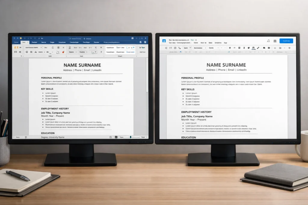
How to set this template up in Google Docs
Google Docs works well for this kind of CV template, but it is worth switching the document into a standard page-based layout first. Google’s own help guidance notes that page size, margins, and page orientation are controlled through File > Page setup, and that these options are available when the document is in Pages format rather than pageless format. For a CV, that matters because you want a stable A4-style layout with predictable margins and section breaks. See Google Docs page setup help.
A simple setup process looks like this:
- Open a blank Google Doc and paste in the template.
- Go to File > Page setup.
- Make sure the document is set to Pages format.
- Set sensible margins and keep the document in portrait orientation.
- Use a readable font such as Arial or Calibri.
- Keep the layout single-column and left-aligned throughout.
Then tidy the paragraph styling. Google Docs lets you change alignment and spacing from the toolbar or via the Format menu. That is enough for a clean CV: consistent font, consistent size, left alignment, and disciplined spacing between sections and bullets. See Google Docs paragraph formatting help.
For a CV, the safest approach is usually:
- keep body text tight but readable
- use a little extra space after headings
- avoid large visual gaps between bullets
- keep heading styles consistent all the way through
- resist the temptation to centre large chunks of text or over-format the page.
The practical goal is not to make the document look fancy inside Google Docs. It is to make it easy to edit, easy to tailor, and easy to export cleanly when you are finished. If you are constantly fighting the layout, the template is too complicated. A CV should be simple enough that you can update one section quickly without the rest of the page shifting unpredictably.
What recruiters scan first on a CV
A clean template matters because recruiters do not read every CV line by line on the first pass. Oxford University Careers Service notes that employers may initially spend only a very short time scanning a CV, so the document needs to present the most relevant information clearly and accessibly. It also recommends concise bullet points, evidence of impact, and tailoring to the role rather than submitting a generic list of everything you have done.
In practice, most recruiters are looking for the same signals in the top third of the page:
- what role level you are operating at
- what kind of work you do
- whether your recent experience fits the target job
- whether there is evidence of results, not just responsibilities
- whether the document feels easy to trust and easy to navigate.
That is why the top of your CV should do a lot of work quickly. Your name and contact details should be clear. The profile should tell the reader what you do and what you are targeting. Your first role entry should reinforce that positioning with relevant scope, keywords, and evidence. If the most persuasive information is buried on page two, the template is not helping you enough.
How to tailor this template by level
The structure above works because it is flexible. The headings do not need to change much, but the order, emphasis, and density of evidence should change depending on where you are in your career. That is the safest way to use one template without making every CV look the same. Brendan Hope’s adjacent guides already split this out for students, no-experience applicants, and executives, which is why this page should stay focused on the base template and only show the key shifts.
Graduate / early-career
If you are a student, recent graduate, or applying with little formal experience, your strongest evidence may still sit in education, projects, volunteering, part-time work, placements, or leadership activities. In that case, move Education higher up the page, keep the profile tightly targeted, and make sure the skills section is backed by proof rather than vague claims. For deeper examples, see CV examples for students and how to write a CV with no work experience.
Professional / mid-career
For most professionals, the same template works best when Professional Experience becomes the dominant section. Your profile should state your function, level, and target role family quickly. Your first one or two roles should carry the most detail, with older positions shortened if they add less value. At this level, the biggest improvement usually comes from replacing generic duty-led bullets with more selective, outcome-led evidence. The template stays simple, but the content becomes more commercial, specific, and relevant to the vacancy.
Executive
At executive level, the template still needs to be clean, but the emphasis shifts to scope, commercial impact, governance, leadership maturity, and strategic relevance. Brendan Hope’s executive guide positions senior CVs as strategic positioning documents, not just longer versions of professional CVs. If you are targeting director, VP, MD, or C-suite roles, use this page as the structural base, then go deeper with the Executive CV writing guide.
Achievement bullet examples you can adapt
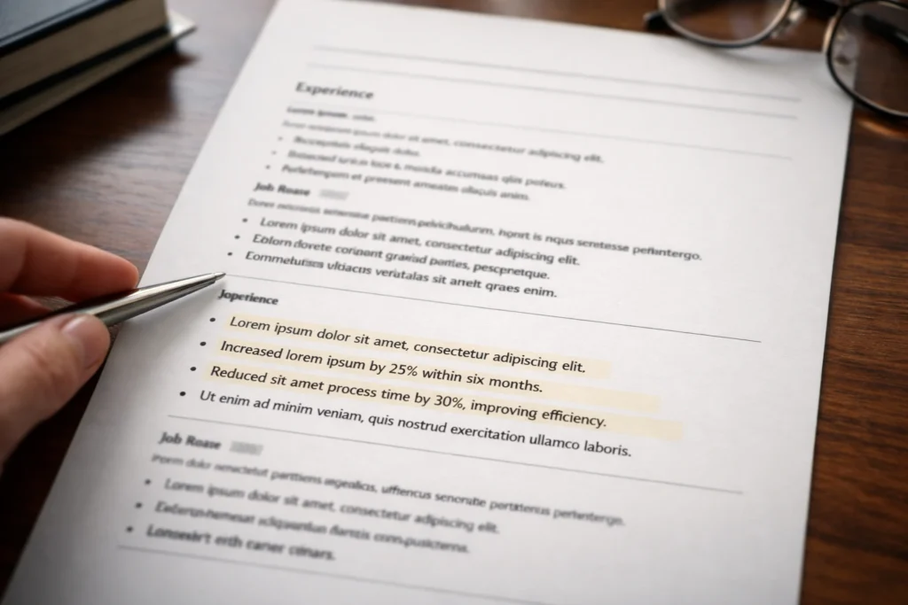
A strong template gives your CV structure, but achievement bullets are what make it persuasive. Brendan Hope’s student, no-experience, and executive guides all lean in the same direction: strong CVs are evidence-led, not just lists of duties or qualities. In other words, the template is only the frame; the evidence is what sells you.
A simple rule helps here:
Weak bullet: describes a task
Stronger bullet: shows what you did, how you did it, and what changed as a result
You do not need every bullet to contain a perfect metric. But wherever you can, show one or more of these:
- scale
- speed
- quality
- revenue
- cost
- efficiency
- volume
- customer impact
- compliance
- stakeholder outcome
Here are some plug-and-play examples you can adapt.
Administration / operations
- Streamlined diary coordination and meeting preparation for a busy team, improving scheduling accuracy and reducing last-minute changes.
- Introduced a clearer filing and document-tracking process, making key information faster to retrieve and reducing admin delays.
- Supported weekly reporting and data updates, helping managers track workload, deadlines, and outstanding actions more reliably.
Customer service / retail
- Resolved customer queries calmly and efficiently, contributing to a positive service experience and repeat business.
- Handled high volumes of face-to-face and telephone enquiries while maintaining accuracy, professionalism, and speed during busy periods.
- Supported store presentation, stock checks, and till operations, helping the team maintain smooth day-to-day performance.
Sales / business development
- Built strong relationships with prospective and existing customers, helping to increase engagement and support conversion activity.
- Followed up leads promptly and maintained accurate CRM records, improving pipeline visibility and sales coordination.
- Contributed to upselling and account support activity by identifying customer needs and recommending suitable solutions.
Project support / coordination
- Coordinated project documentation, timelines, and stakeholder updates, helping keep delivery on track across multiple workstreams.
- Monitored actions and deadlines across meetings, improving follow-through and reducing the risk of missed tasks.
- Supported cross-functional communication between teams, helping information move faster and reducing avoidable bottlenecks.
Finance / data / analysis
- Maintained accurate spreadsheets and reconciled records carefully, helping improve reporting quality and reduce errors.
- Analysed routine data trends and flagged discrepancies early, supporting better decision-making and issue resolution.
- Produced regular reports for internal stakeholders, turning raw data into clearer summaries and actionable insights.
Graduate / no-experience style examples
- Led a university group project from planning to presentation, coordinating tasks across team members and delivering the work on time.
- Balanced study with part-time work, demonstrating reliability, time management, and the ability to perform under pressure.
- Used volunteering, society leadership, or event support experience to build communication, organisation, and teamwork skills in real settings.
When you adapt these, keep the wording grounded. The National Careers Service recommends showing the skills and strengths relevant to the job, and Oxford Careers stresses that recruiters scan quickly and want the most relevant information to stand out. That means your bullets should be selective, specific, and job-relevant rather than padded with generic claims.
Common CV template mistakes that hurt readability or ATS parsing
The biggest mistake people make with CV templates is assuming that a more “modern” design is automatically a better design. In practice, many of the features that make a template look impressive on first glance can make it harder to scan, harder to edit, and less reliable when uploaded. Brendan Hope’s ATS guidance highlights recurring UK problems such as two-column layouts, non-standard headings, heavy design elements, unclear job titles, duty-heavy bullets, and inconsistent formatting.
The first risk is layout complexity. Two-column templates, sidebars, floating text boxes, charts, and rating bars often look polished, but they can reduce scan-readability and create parsing problems. A clean single-column structure is usually safer because it keeps your employment history, dates, skills, and qualifications in a predictable order.
The second risk is trying to be too creative with headings or labels. If you rename core sections with phrases like “My Story”, “Where I’ve Been”, or “What I Bring”, you may make the document feel more original, but you also make key information slightly harder to find. Standard headings such as Professional Experience, Education, and Key Skills are usually more effective because recruiters can navigate them instantly. Prospects reinforces the value of clear, conventional formatting.
The third risk is design crowding out evidence. A template cannot rescue vague content. If your page is filled with icons, coloured boxes, visual skill bars, or decorative sections, but the bullet points underneath are generic and duty-led, the CV still underperforms. Oxford’s guidance is clear that evidence of contribution and impact matters, and Brendan Hope’s ATS guidance makes the same point in a UK job-search context.
The fourth risk is inconsistency. Prospects recommends keeping fonts and font sizes consistent, using clear headings, checking margins, and saving the file in the format requested by the employer. Small inconsistencies rarely destroy an application on their own, but together they create friction.
If your current template uses columns, icons, tables in the header, graphic ratings, or over-styled section names, simplify it before you worry about anything else. For a deeper breakdown of these issues, see ATS CV formatting mistakes (UK).
Fix your CV template in 15 minutes
If your CV feels cluttered, generic, or harder to scan than it should be, you do not necessarily need to start again. In many cases, a quick structural tidy-up makes a noticeable difference. Use this checklist:
- Simplify the header so it includes only your name, town/city, phone number, email address, and LinkedIn URL.
- Check your section headings and rename anything vague to standard labels such as Professional Experience, Education, and Key Skills.
- Cut your profile down to 2–4 lines that explain what you do, what level you operate at, and what kind of role you are targeting.
- Move your strongest evidence higher up so the most relevant recent experience appears early.
- Rewrite three weak bullets so they show outcomes, improvements, or value, not just duties.
- Remove columns, icons, charts, text boxes, and decorative graphics if they are making the document harder to scan.
- Standardise fonts, spacing, and date formats so the CV feels consistent from top to bottom.
- Trim older or lower-value detail if it is pushing the document past a sensible length.
- Check the file name so it looks professional before you send it.
- Save it in the format requested in the job advert, rather than assuming one format always fits. See Prospects and the National Careers Service.
Get a free CV review before you apply
A template can help you organise the page, but it cannot tell you whether your CV is actually clear enough, relevant enough, or strong enough for the roles you are targeting.
FAQs
Is there one “best” CV template for UK jobs?
Not in a universal sense. The safest choice for most UK applications is usually a clean, single-column, text-led template with standard headings and strong evidence. That is different from saying there is one perfect template for every person, sector, or seniority level. The right version still depends on your level, target roles, and how well the content is tailored. See Prospects.
Should a UK CV be one page or two?
For many UK applicants, one to two pages is the normal range. Prospects notes that a CV is usually no longer than two A4 pages, although some senior or specialist cases may justify more. In practice, one page can work well for students, graduates, or very early-career candidates, while two pages is common for professionals with more evidence to show. See Prospects. If you are early-career, see CV examples for students. If you are senior, see the Executive CV writing guide.
Should I send my CV as a PDF or a Word document?
Use the format requested in the advert or application system. Prospects specifically advises checking what format the employer wants rather than assuming. If no format is specified, PDF is often preferred because it preserves layout more consistently, but some employers or portals may still ask for DOCX. See Prospects.
Can I use colour on a CV?
Yes, lightly, but keep it restrained. A little colour in headings can work if the CV remains highly readable and professional. The problem is not colour itself; it is when design starts to interfere with clarity. If colour leads to lower contrast, harder scanning, or an over-styled layout, it is working against you. For most applicants, simple and consistent is the safer option. See Prospects and ATS CV formatting mistakes (UK).
Should I include a photo on my UK CV?
Usually, no. The National Careers Service says you do not need to include a photo on a CV for standard UK applications, and the same applies to personal details such as date of birth or marital status. The focus should stay on relevant evidence and fit for the role.
Can I use the same CV template for every job?
You can use the same base template, but you should not use the same content for every application. The structure can stay broadly consistent, but the profile, skills emphasis, and bullet points should shift depending on the target role. A template helps with consistency; tailoring is what makes the CV competitive. See Oxford Careers and the UK CV format guide.
Is this template suitable for graduates or people with no experience?
Yes, but the emphasis changes. If you have limited formal work history, move Education higher up, use projects, volunteering, part-time work, placements, and extracurricular evidence more strategically, and keep the profile tightly aligned to the role. For fuller examples, see CV examples for students and how to write a CV with no work experience.
Do templates actually improve interview chances?
A template can improve readability, consistency, and structure, but it does not guarantee results. Strong outcomes still depend on relevance, evidence, clarity, and how well the CV is tailored to the role. In other words, the template can remove friction, but it cannot replace substance. If you want a human sense-check before you apply, use the Free CV Review.
Recent Comments